my empty-headed daydreams | |
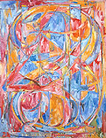 Jasper Johns | London... Strange place. Every time I visit I come away exhausted and not a little confused; exhausted because there seems to be so much to see and do and there are not, as has often been said before, enough hours in the day, nor indeed enough energy in these tired bones; and not a little confused because the whole experience seems so surreal it amazes me that people choose to live this way every day. I should qualify that really, shouldn't I? It goes like this: every time I experience London I leave thinking I have just spent a day or two running too fast to pretty much stand still. All the journeying through tunnels or on buses or on foot, seeing so much of course, but also wondering, you know, all this going on and going out and when does anyone have their time to create, their times touching down inside and reflecting? I guess it's a something developed through time and experience, and my own mode of living just doesn't mesh, doesn't make the same kind of connections Londoner's do. Many might sneer and suggest I just don't have what it takes, and that's fair enough; I may prefer concrete to green fields, by and large, but I haven't the concrete mind needed to survive London. I just kind of cave in after a couple of days; can't wait to return to my attic, my books, my records and my empty-headed daydreams. Call that a weakness if you will. Anyway, back from London and here is that time to reflect, that time to share some opinions and meanderings of the mind with whosoever cares to find their own time to join me. Starting with going to the Tate Modern and looking at the Warhols. Now, don't get me wrong: I really don't like the Tate Modern per se, I just wanted to see the Warhols. And some Jasper Johns; I liked seeing the Jasper Johns number paintings again because they are so beautiful and make me wonder what my friend Brendan would think if he were to see them. Brendan has this meta-tourettic tic whereby he not only feels the urge to count things but to count them in German (not ALL the time of course, so it's more a meta-mild-tourettic tic), which should explain my interest in having him see the Johns number paintings. |
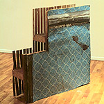
Gordon Matta Clark | The Warhols were largely wonderful, of course, and naturally I would say that. The dark red of Five Deaths is just so gorgeous, whilst the blue of the Jackie painting simply takes my breath away. I could stand and look at that blue for hours, a response which points towards the truth in the feeling that Warhol was a great colourist and in fact this painting is one which shows us that the meaning of image is transitory at best; the painting is no longer about Jackie Kennedy and her/America's grief, it's about blue and black interplay, about glow and shadow, depth and the essence of sorrow. The Marilyn Diptych is always good to see too, if only because the collisions of purple, green and orange (the yellow and red too, but less so) oscillate wildly and make me want to disappear into the canvas. Then there's the Double Elvis painting; clearly not the one Dylan swiped/was given because there's no sign of holes left by darts, but terrific nonetheless. The accompanying card beside on the wall suggests many levels of meaning in the painting, except perhaps the most important one: didn't Elvis look FANTASTIC at this age? I get down on my knees in front of Elvis. No really, I do get down on my knees... I want to see if this was screened before or after the canvas was stretched on its frame. The answer seems to be 'before' since part of Elvis' foot tucks under the bottom edge of the frame; similarly, the Five Deaths also seems to have been screened before stretching, as the right hand edge overlaps the frame, which is more strange given its scale, but there you go. As far as I am aware, not many other people were that interested in these details on this (or for all I know any other) day, which is probably as it should be... So the Warhols were great, as indeed were the Donald Judd boxes and the Dan Flavin light fittings, whilst Richard Serra's Trip Hammer sculpture was frankly downright scary; all that energy and weight so precariously balanced. In fact Richard Serra is my favourite sculptor by a significant distance; the experience of walking around, through and in his Torqued Ellipse series of works will stay as one of my finest experiences until I die. |
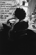 Adrian Piper | And Louise Bourgeouis' squirrel. So, enough individual highlights there for sure, but the Tate Modern as a whole? Not my favourite place at all. A friend from New York recently said it was like a mall in Montreal which may or may not be accurate (not having seen any malls in Montreal) but sounds so good that I'll blithely concur. I'm not sure if Montreal malls are always crowded, but the Tate Modern always seems to be depressingly busy; depressingly in the fact that whenever I look at the people trailing around I seem to see so little interest in the faces of the visitors, only a mass of boredom conveyor-belting along on some Modern Art theme-park ride. I didn't enjoy much of the Century City pay exhibit at the Tate either. A reflection on a whole century, especially one as accelerated and fractured as the 20th is quite an undertaking really isn't it? It seems sensible to give the reflection some kind of theme, and although using cities is an interesting one, the way in which it is done here just lacks cohesion (and I cant help feeling if they had been able to use the whole gallery for the theme they would have had more scope for success), and in fact even the individual elements seem devoid of much genuine interest or surprise. The error lies, I feel, in the insistence on giving each city it's own limited time-frame, and as a result we are denied both the sense of the wider context of the work (and the city), and indeed many other interesting and important works and moments in the century which the city may have been home to. A classic example would of course be New York, whose frame of reference of '69 - '74 manages to show us some wonderful Gordon Matta Clark work, (and Adrian Piper's photographs are dark depths of love in the shadows), but as a result simply blanks out the important Pop explosion of the early '60s, the post-punk explosion of the '80s and all the connections that lie therein. And that's just personal interests at play: I fully expect anyone with an interest in Nigerian politics and art could say the same for the Lagos exhibit, a room which, incidentally, left me cold and disinterested, but that's just me. I am so Western it's embarrassing... and as a result my response to the Rio room was similar, (although I did love Oscar Niemeyer's drawings), whilst the Tokyo section kind of reminded me that I have never really cared for the Japanese aesthetic much (although the mail rocks were pretty terrific). |
 Thanks for making me sad, Tracey... |
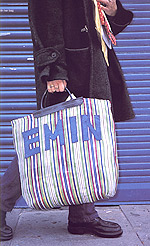
One of the more enjoyable and engaging parts of the Century exhibit is in fact the London section, with it's focus on the Brit Art of the fin de millennium; the so-called bright young things of British art who of course are these days not so bright and not so young, but are at least more famous and wealthier. At least some of them. Tracey Emin, for example. There's something extremely depressing about seeing Tracey's embroidered box of knickers sitting inside a glass case on the floor of the Tate Modern. It looks sad and lonely and tired and miserable, which is maybe the whole point. Isn't Tracey all about being sad and miserable? As well as famous and wealthy... Would we think any differently about the piece if we didn't know who Tracey was? I don't think so. It's just a depressing thing to have produced and to look at. Which is a good thing, I think. Thanks for making me sad, Tracey. But hasn't there been a lot of hype in recent years about Emin being confrontational as well though? It feels like a dream already. Maybe we just can't be confronted by art any more; maybe we just aren't surprised or shocked by anything at all. The Tate Modern clearly suspects otherwise because it has signs that suggest we, the general public, might find some of the works 'challenging'. It suggests that if you feel 'challenged' you should ask for assistance. It's quite a funny sign, and one of the best aspects of the gallery, although whether you read it as funny or vaguely insulting to the intelligence of 'the general public' is a matter of personal interpretation. I also found the Situationist style plundering of a comic strip to tell the tale of Matthew Collings and Tracey Emin getting into a conflict about who should have their portrait painted by Lucien Freud (they save him from being run over by a bus!) to be so amusing that I chortled out loud, drawing bemused glances from two punkette girls (Tate stickers dotted on their foreheads - how wacky!). The comic strip is part of a bill-posted wall of the London bunker and rightly is tucked away from prying eyes. I saw only four others down this alley in the time I was there (the two punkettes and two Germans who hurried past muttering something under their breath looking anywhere but at the wall of art) which was either very depressing or very pleasing. I go with the latter. Another highlight of the wall was blown up photos of audio cassette cases; two mix tapes sent between what appear to be fledgling lovers at the start of a romance. I came away thinking I'd far rather have a copy of the tapes than the weighty official exhibit book. Or, indeed, a memento mug. Another terrific marketing opportunity missed. Oh well. |
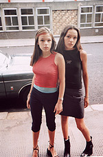 from Juergen Teller's Go-Sees | Best of the London section however is the selection of Juergen Teller's go-sees photographs. These photographs of young girls who regularly turn up at the door to his studio with the dream of being the next Kate Moss are terrific for the manner in which they collapse innocence and sexual tension into one troubling moment. They are images that both reflect and question the nature of beauty and sexual propriety within contemporary society, without being judgemental (and it's a moot point as to whether the lack of judgement is part of the argument for or against the images), and naturally I buy the book. I also buy a book of photographs by Sarah Jones, whose large colour portraits of teenage girls I mentioned in my Warhol piece and which I fell in love with when I saw them hanging in the Tate Britain a month ago. Jones' photographs inhabit a similar world to Teller's in that they too raise questions about the nature of voyeurism and make us question our perceptions of desire and regret, although they also contain more references to fine art and painting in their careful staging and the meanings we place in objects. They also seem to be about the very boredom of teenage... the ennui of being young and tied to a home that in spite of all luxuries and beauty is nevertheless a prison. |
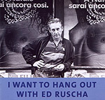
| My third purchase (after I pass up a chance to buy a book of Rita Ackerman work for 65 notes - I just know I'll regret that) is a music CD. Which is probably a strange thing to be buying in a gallery shop, but when I tell you that the title of the CD is 'I Want To Hang Out With Ed Ruscha' you'll maybe see the connection. For those of you still unsure, I'll tell you that Ruscha is one of my favourite 'text' artists, and that this CD (singed by Rushca!) was a limited edition release to accompany a show of his work last summer at the Anthony D'Offay gallery in London. I never got to see the show, unfortunately, but Phaidon recently published a great collection of Ruscha art in the terrifically titled They Called Her Styrene. 'I want to hang out with Ed Ruscha', by the way, is a great song by David Stephenson and Richard Bell, with Bell being, I'd wager, the very same Richard Bell who once played guitar with Bristol's Bop Artists the Blue Aeroplanes, leaving them early whilst they still flew above the clouds and burned with intense vision. If I'm wrong on this one, then, um, I'm wrong... sue me (actually please don't sue me. I am very poor). And incidentally, although it's unclear as to whether she likes Blue Aeroplanes, Britney Spears is a big Ed Ruscha fan and probably wants to hang out with him too. |
 Sigmar Polke | I did get to the D'Offay gallery this trip, however, and managed to see the Sigmar Polke work in what was the opposite experience to the Tate Modern. We were, in fact, the only two visitors to the gallery... a strange and pleasant experience. I looked long and hard at the paintings, trying to figure out if I would like them more or less with or without the pixelated (or Benday Dotted) layers. I think, in the end, I go for With, because hey, that's what Mr Polke decided they should be like and who am I to argue? I like the paintings a lot, especially the one with what appears to be an armoured stormtrooper holding a massive missile launcher, and the one where Robocop seems to float on a post-Pop neo-expressionist ground. Naturally my predeliction for these paintings could be traced to my love of Warhol and Lichtenstein with their screen/benday treatments, and of abtract expressionists and indeed neo-expressionists. Which makes Polke a knowing manipulator of fashion. And that's fair enough I guess. As an aside, I wonder how long it takes Polke to paint the black layers - they do look hand painted and not screened close up - and/or whether he has minions to do all that for him. Like Jeff Koons, or Bridget Riley or Warhol or indeed any of those famous Renaissance painters... I don't expect Polke had any assistants with him in the late '60s to help assemble his sketchbooks, but it would be a great joke if it turned out he did. 'Ah!' they might say (in German, possibly), 'a photograph of a couple picnicking by their Volkswagen! This must go in the sketchbook!' And then Sigmar finding the page in the sketchbook later in the day and sniggering to himself whilst adding a few biro lines. The sketchbook pages collected in the smaller D'Offay gallery are terrific, off-the-cuff examples of how sketchbooks should be; all messing around with ideas and sticking in great images just because, hey! they are great images! There's also the amusement of seeing his approach to the high-school art teachers' favourite homework of sticking in a part of a photo and then extending from it in a drawing... I giggled. |
 Sarah Jones The Dining Room | Of course there's so much art in London it's kind of scary, but you know finding the time in a couple of days to see much of it is kind of difficult, especially when there's also good friends to share lunches and dinners and beers with . The Barbara Kruger show at the South London Gallery had to be missed, for example, simply because logistics meant I would have had maybe ten minutes to actually look at anything before heading back to the centre of the city. Ditto the Emma Kay show at the Chisenholme gallery which I had wanted to catch because she works with text and you know, as I already hinted at through my mention of Ed Ruscha, I have a predeliction for text art... And then finally there was the Saatchi. Closed until midday... not much cop when you have only a morning left to do anything. Except walk much too far from the tube station, studiously avoiding that cross walk on Abbey Road and wondering how it is that when in London the language you seem to hear least of all is English. Which, coming from Exeter is a good and refreshing thing of course. As is, oddly enough, being back in Exeter, or more accurately, back in my attic, armed with my books and new CD purchases (Phil Ochs' American Troubador, Richard Hell's Blank Generation and Dylan's Self Portrait), perched in front of a screen and rattling madly at the keys of this machine, back in my empty-headed daydreams. © Alistair Fitchett 2001 |