Something Worth Celebrating | |
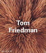
| Having just spent half a morning writing about an artist whose work I really don't rate, I figured it was about time I wrote about something that I actually like. Well, firstly, there's Tom Friedman, subject of a recently published edition of Phaidon's excellent Contemporary Artists Series. Friedman is one of the most exciting young sculptors at work today, and when I tell you that sculpture generally leaves me cold, you'll maybe understand just how strange it is that I should warm to Friedman so much. Like David Mack, whose work is similar in that both tend to work with materials of the everyday (Mack in a larger scale with things like magazines and bricks, Friedman with smaller materials such as tooth-picks and bubblegum), Friedman's work is full of wit, wisdom and quirky beauty. I like the idea that Friedman is working in some kind of post-digital mode. I like the idea that his work re-focuses attention on the everyday; takes objects we take for granted and manipulates them into something which challenges our sense of awareness of our environments; makes us feel a bit foolish and hopefully shakes us out of our complacency a little, where complacency here means a sense of not making as much of our worlds as we might. Friedman challenges us in a post-political manner and in a post-personal manner also: his work is so un-weighted by either irony or earnestness it attains an ethereal quality, a quality that makes a simple statement about beauty and possibility. What's so interesting about someone like Friedman is that he doesn't stick to one discipline, or rather that he blurs the boundaries of what is or isn't sculpture. In fact, some of his most interesting pieces are on paper. 'Everything' is a large sheet of paper with 'all the words in the English language' written on it - this seems to me to question what we mean by language and by setting it in physical form makes us realise its organic nature; 'Untitled' is the artist's signature written on the wall in a spiral until the pen has run out of ink; another 'Untitled' is an investigation of line and systems, whilst '1000 Hours of Staring' is simply five years of staring at (the paper on) a wall and it does exactly what it says on the tin. These works, and others, suggest connections with performance and conceptual artists like Piero Manzoni, Bruce Nauman, and of course his 'Erased Playboy centerfold' is an obvious homage to Raushenberg's 'Erased De Kooning Drawing'. It's not unwelcome company to be in. Likewise Tony Cragg, whose scatter works Friedman references with many of his pieces, like 'In Memory of a Piece of Paper', the 'Untitled' piece with the paper stars pinned to a wall or the one with the balls of Styrofoam; or best of all the pills pictured in the Physician's Desk Reference made from Play-Doh scattered on the floor, or the 'Untitled (Small World)' piece where there is a very Cragg like arrangement of things again made from Play-Doh. It's all wonderful stuff. What I like best about Friedman, however, is the evident awareness in is work that you don't have to be dumb to be funny, that you don't have to be glum to be serious. Friedman makes making serious Art look like a lot of fun and this Phaidon book communicates that very well. That's got to be something worth celebrating. |
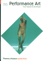
| Speaking of Performance Artists like Nauman and Manzoni, now would be an opportune moment to mention that Thames and Hudson have just published a revised edition of their Performance Art tome as part of the relaunching of the internationally renowned World Of Art series. First published in 1956, Thames and Hudson are celebrating the series' 45th anniversary by giving a new look to both new titles (including Lisa Mintz Messinger on Georgia O'Keefe and Kenneth Frampton [no relation to Peter I presume] on le Corbusier) and re-prints of their classic titles (like Herbert Read's A Concise History of Modern Painting which has sold in excess of one million copies worldwide to date). Naturally quality can never be judged by quantity sold (look how many records Oasis sold... or the Beatles, come to that) but in this case it's fair to say that the World of Art titles deserve their sales figures by being affordable, portable, informative and accessible all at once, and like Phaidon's recent and on-going Art and Ideas series, the World of Art books are terrific ways in to specific subjects. |
Also recently published by Thames and Hudson is Steven Heller and Mirko Ilic's Icons of Graphic Design. It's hard to break any kind of new ground with books of this sort, but I think Heller and Ilic manage it by approaching the concept of Design Icons from a circuitous route rather than one which insists on a linearity of progression. As a result, there's no explicitly time-based 'history' of Graphic design as such, rather an investigation into the ways in which designers have approached and treated similar themes. It's a great way of exposing connections, and of showing the importance of investigation and some sense of historical awareness and context. Grouped under occasionally embarrassing headings ('Fists and Starts'?), we therefore find under 'Photographically Surreal' a John Heartfield magazine cover from 1935 alongside a wonderful Esquire cover from 1960 by George Lois and Carl Fischer showing Andy Warhol drowning in a can of (what else?) Campbells Soup, a classic 1949 Seventeen cover by Cipe Pineles (it's my favourite ever magazine cover and I used a copy of it for a mix-tape once titled 'Records are Sacred When You're Seventeen' - and a prize to the first person to tell me the song and band that gave that title...) and a 1997 New York Times Magazine cover image of some bloke standing in a landscape of white technology... hmmm. I think I could have found a better contemporary 'Icon' but anyway, you get the idea. It's obviously been difficult to find the large number of bona-fide classics needed for a book like this, and if there is the occasional inclusion of something that may seem a little on the unworthy side, there is also the delight of the inclusion of things like Robert Massin's wonderful 1964 design for Ionesco's The Bald Soprano, part of whose spread gave inspiration to the cover of one of my own Fantastique! fanzines. Not that I'm an icon of graphic design of course... | |
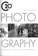
| Phaidon are doing great things for opening up the history of photography through their fantastic 55 series, but also worth mentioning is the recently published small format version of Reuel Gordon's 20th Century Photography (Carlton Books). Subtitled 'a complete guide to the greatest artists of the photographic age', the book goes some way to delivering on that grand promise by collecting together a fine cross-section of images by artists as diverse and great as Marc Riboud, Cindy Sherman, Henri Cartier-Bresson, Eve Arnold and my personal favourites Willy Ronis, Weegee, Berenice Abbott, Paul Strand and Alexander Rodchenko. If there is an irritation it's that not all the artists included seem to be truly 'the greatest', but that's a question of taste and opinion as much as anything else. Also of annoyance is the printing of images across the centre fold of the book, although at the price of a tenner it's hardly the end of the world. © Alistair Fitchett |