Seeing Sound | |

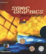
| There have been loads of books down the years about album cover design, or, for you youngsters who don't understand that term, 'CD cover' designs. There have also been lots of books collecting examples of Pop ephemera like flyers and posters, all of which have been at least mildly diverting and at best, like the great Blue Note Album Covers book, genuinely essential 'reading'. What there haven't been, as far as I know, are books that attempt to deal with the whole notion of picturing sound; not just design as some packaging device for sound, but as a visual interpretation of sound. Which is, in part, what Matt Woolman's Sonic Graphics: Seeing Sound (Thames and Hudson Ł17.95) attempts to do. Of course it covers 'traditional' printed graphic media like promotional posters and album packaging, but it also turns attention to screen based work and other digital media. The book is broken down into three sections: 'Notation', 'Material' and 'Atmosphere'. For me, the first two of these prove the most interesting, with 'Notation' in particular uncovering some intriguing work, such as Paul Motta's 'sonic cartography', where the visual mapping of sound creates strange diagrams that could be circuit diagrams or flow charts for data management. It's intriguing stuff. Similarly interesting is the work of Why Not Associates, whose screen based work for music videos by the likes of (whisper it!) Smashing Pumpkins, Janet Jackson and Lenny Kravitz merges type and visual texture deliciously and makes for far more interesting artefacts that the music itself. Less compelling though are the pages devoted to terminally dull computer generated mathematical models of sound. Supposedly following up on work produced by the likes of Kandinsky and Klee, the work of Fred Collopy in particular strikes me as hippy nonsense, but then I never did like those painters anyway. And of course this is just me. I'm sure there are advocates of fractal-type projections who would lap this stuff up. Personally, too, I'd have liked to see some examples of Harry Smiths' work in here, but then maybe that is too obscure and hard to track down. There's a similar problem in the 'Atmosphere' section of the book too, where there is far too much space given over to tired computer generated 'sculpture' and other digital effects. All of which can't even begin to compete with the analogue forms created by the likes of Glenn McKay and other such luminaries of the '60s, whose oil-dish projections still look way ahead of anything attempted with computers. And whilst we're talking about projections, where are the examples of Gustav Metzger's gorgeous work? The 'Material' section of the book is the largest, and thankfully most consistently rewarding. Here are collected examples of printed material, from flyers to posters to album packaging, and there's a good spread of work from across the ages. Typically for these days the work is not presented in any chronological order, although an order of sorts is imposed by grouping work by design groups or print houses together. Personal favourites are the examples from Nashville's 120 year old Hatchshow Press, where you find posters for shows by Johnny Cash, Marty Robbins and Bill Monroe evoking a kind of lost simplicity that I find enduringly appealing. It's mirrored in the work of the Independent Project Press which I'm delighted to see included. The IPP have been crafting hand letterpress work for a good many years, and were notably involved in producing packaging for a number of 'post-rock' or 'math-rock' groups back in the '90s. All of their packaging evokes an earlier age that, to my eye at least, is compellingly beautiful. Then there's some pages from a book of photographs of Palm Desert by Rudy Vanderlans, inspired by the Van Dyke Parks song of the same name, which has found its way into my notebook list to be tracked down. Or the EGH and BuroDestruct design houses, whose work on things like posters and flyers for acts like Grooverider, Peshay, Jimi Tenor and Fridge is both quintessentially contemporary and already strangely evocative of the recent past. In parts, then, Sonic Graphics is great, but as a whole it feels too fragmented, too lacking in focus to really make it as something new in the realm of books that record the visual face of musical culture. What I'd really like to see would be a book dedicated to, say the Independent Press Project, or the history of the Hatchshow Press. Now they would be something else... © Alistair Fitchett 2002 |