Bored and Dumb?
| |
|
Almost exactly a year ago I wrote about how much I love Andy Warhol, about how I consider him to be the most important artist of the last century. At that time I wrote mainly about what I guess you could call the phenomenon of Warhol; of how he was the essence of the moment in cultural evolution when the boundaries of Western capitalist mediated culture really fully blurred and the foundations for what we now call Popular Culture were laid. And for that of course you can praise him to the heavens above, or damn him all to hell. What I didn't write much about before was the Art. Which might seem odd when we're talking about an Artist, but then this is Andy Warhol, and somehow when people talk about Warhol it's usually Art coming a poor second or third behind, I dunno, the people like Edie, the drugs, the Factory, the silver walls, the drugs, The Velvets, the sex, the drugs, the wigs, the famous celebrity associates, the drugs... Ah, and okay, so actually maybe the Art usually comes tenth or eleventh. And that's a shame, because as the current Warhol retrospective at the Tate Modern in London amply illustrates, Warhol's Art was as much about his skill on the canvas as off it. The Flowers are a great starting point for any Warhol show because they seem at once to be so non-Warhol, and yet also so very totally-Warhol. It seems such an odd subject matter. Flowers. Didn't the hippies love flowers? And wasn't Warhol set up starkly against all that with his East Coast Factory and his insistence on the mechanical, and the anti-hippy stance of the Velvets? Maybe that's why the Flower paintings look so cool, especially the 1967 ones with the screen registration all shot to hell, and that wonderful turquoise green vibrating off the canvas. It's like the paintings are deconstructing the flowers, taking them to bits and reassembling them like warped machines. The '64 ones by contrast look quite tame, kind of restrained and dopey, the screen registration only just out, and in the juxtaposition of the two sets you can see a real development of idea, or of responding to accident. It's like the '64 flowers were done, and there's a thought of 'oh that's cool, but I kind of like that missed registration, we should play on that...' and then three years later here's evidence of really taking that discovery and doing something with it. For me that's what it's all about, that's what Warhol, what Art and Pop is all about; looking at what's there, at what you just did, making judgement, taking maybe the unexpected and pushing it further. After the intro of the Flowers, the exhibition then becomes largely chronological. The room of early paintings is intriguing if only to see how Warhol and his work struggled to cast off the shackles of Abstract Expressionism, of 'real Art', 'real' painting. The subject matter fights against drips and gestural marks, and it's a dynamic battle that's interesting to watch, the more so when you have the hindsight that tells you the Subject wins out in the end. |
|
It's Warhol's drawings that really send me though. Warhol's drawings are just glorious. There's one smallish room given over to just drawings, and occasional other pieces dotted in other spaces of the show and they add up to the best evidence there is that he was a great artist, if those sorts of skills are what you judge greatness by. And even if you don't; even if what you judge greatness by is some sense of individuality, or of a desire to experiment and develop through the art, then Warhol's drawings show that too. There's a terrific sense of striving in Warhol's drawings; striving for beauty, and for an essential distance between object/subject and surface. There's a real assuredness in the line work of so many of the drawings; a Modigliani-like sweetness of single purpose to the line; a Matisse-esque simplicity; a Cocteau-ish sensuality, and yet next to this there is the desire to extract the hand from the line, to break the line up, to fracture the connection between humanity and the surface of the drawing. It's in the jagged line work of ' Boy Picking His Nose' of 1948/9, and it's in the strange almost dotted-line effects in 'Seated Aging Female' (1948) and 'Male Head' (1950). And of course most obviously it's in the blotted line work he is most famous for; in all those commercial drawings of shoes, hats, cats and goodness knows what else. I love all those commercial drawings. I think they are gorgeous, evocative capsules of a moment that quickly passed; drawings that capture a certain naïveté of an age about to lose all innocence: yet another of those moments of America losing its Innocence. I think drawing is so often really vital in understanding something of an artist. I recall seeing the drawings of Roger Hilton in Cornwall some years ago and being bowled over by their fantastic energy. Similarly seeing a Modigliani drawing in Bilbao and being in awe of the simply executed beauty. Seeing artists' drawings is like seeing minds at work, and for all those who say Warhol was just some weird recording automaton, then his drawings both support and explode that myth completely. Support in the sense that drawing is of course essentially about recording, but exploding too because drawing is also intrinsically about looking, seeing and understanding. You can't really have one without the other. You can't look at Warhol's work and not see some kind of internalisation of information, some deep understanding of the world through drawing and through Art. That this understanding is not always immediately evident in the 'finished' (or at least publicly visible work), is often diffused and dodged by Warhol's own evasive posturing is irrelevant. I've long considered that the best definition of any artist is that there is a thirst for, if not knowledge, at least for some kind of deeply personal understanding of the immediate world in which one finds oneself existing. An artist is inquisitive, perhaps finds beauty in places most others ignore, is always intrigued by the very thingness of the world. And by that 'thingness' I mean also the very essence of perhaps paint in isolation; the world of interest can be boiled down completely to simple isolated precision, like to say the exploration of 'white' in Robert Ryman's paintings. I think that Warhol's films are great drawings too. 'Empire State' especially. Someone told me they were at the show the day before me, and they saw the moment in the film when the lights come on in the tower. At first I was jealous I hadn't seen that part, but then I realised it didn't really matter all that much after all. I had seen some great scratches and glitches, like moving Twombly marks, on the film that he hadn't, and really those are what the film is all about; moments, fragments passing in time. The lights coming on are no more a part of the film than the scratches; the subject (the building) of the film is no more the star than the accidental blotches. Because when it comes down to it 'Empire State' is a great ambient movie, a great ambient drawing. |
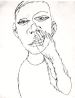
Still detail from Dryden Goodwin's 'Closer' - 2002 |
And of course watching 'Empire State' got me thinking that if the film is about the nature of the (analogue) medium as much as it is about the subject, does the digital reproduction of that medium do justice to the work? I mean, if it's about analogue film, and if the analogue film does degenerate, and does give a unique experience each time it is shown through the introduction of possibilities like dust or hairs in the projection equipment, new glitches inevitably introduced on the surface of the film itself through handling, then is digital reproduction essentially denying those possibilities? And if so, what is the point of digital reproduction of this particular original analogue source, and more to the point maybe, what is the very thingness of digital media itself? I think in particular of the marvellous Dryden Goodwin installation I saw the previous day at the Tate Britain, which uses carefully choreographed video and sound to give an illusion of ambience. Perfectly projected on plasma screens, the image never alters from one showing to the next. It's always perfectly identical each time it is replayed, and whilst it's very beautiful, and evocative of the voyeurism of the act of drawing, I can't help but also wonder... what about the accident? And so I once more start pondering the potential value of introducing viruses into digital art works to intentionally degrade, decay and alter the work in random ways. Which is to get off the subject altogether of course... The subject of course being Warhol, and oh look, back in drawings again, and there's that turquoise green again, in the stockings of the bullfighter, shining, singing out beacon like from across the room. And there's Basquiat's '81 cars, draped around each other in the 1954 drawing 'Dead Stop', like a comic book recitation of the Death and Disaster paintings. Earlier I said that the Subject wins out in Warhol's work. It's widely recognised and accepted that much of Warhol's work is about celebrating the consumer artefact, be it soup can, Brillo box, Coke bottle or movie star. There's another argument though that in fact Warhol's paintings are actually not about those things at all, but are simply about colour. The subject matter is only there as a hook for the colour. If that's the case then purists might argue that this shows Warhol's lack of rigour in pursuing the goal, that he didn't dare to cut the chains of figurative painting. Such people might suggest that, say, Yves Klein's blue canvases are purer and more dynamic than Warhol's blue 'Jackie''s, or 'Blue Liz as Cleopatra', but of course they might be right from a certain point of view, but I know which painting I'd rather look at. It's Warhol every time, because not only does he have a marvellous Blue to adore, there's also the beauty of Jackie or Liz to worship. Which is some spectacular added bonus. The 'Star' paintings and portraits are intriguing artefacts, especially in 2002, showing particularly how context changes meaning over time. Because in 2002 they are no longer about the mythology of Stardom, but rather about mediated memory, about the transience of the myth of Stardom and about forgetfulness. The paintings are far less about personality and the cult of the individual, but are rather more abstract notions of colour and form, and you can't help but wonder if Warhol would have approved wholeheartedly of this. His desire to be taken seriously as a 'painter' finally come to fruition as the subjective content of the paintings loses its focus; the meaning in the subject falls away and leaves only the painting. |
Face Off 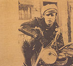
|
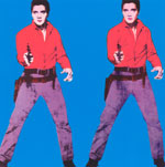
There's a great room in the Tate show that poses gun slinging Elvis' (flanked on one wall by Jimmy Cagney), opposite Marlon Brando. There it is: Elvis toting his pistols at Brando, a challenge of extreme Popism, and Brando gazing back, looking like he could give a damn. Of course in 2002 it's not about Elvis or Brando, not least because I'd bet a whole load of the people passing through this exhibit wouldn't know or much less care about who Elvis or Brando were, will see only faces and poses that have entered the abstract vocabulary of Pop. In 2002 it's not about Elvis or Brando, but is instead about the implicit sexuality of the poses, of the very Image of the images. How fitting then that the other piece in the room is 'Kiss', a close up of meshing lips and tongues. Here's what it all boils down to then: Sex. Of course it's also about colour, especially in the coloured Elvis, where the play of the blue ground against the purple of the jeans is just electric. But then again that might be just me and might instead say more about my sad life than anything else... So it might be about colour, but mainly of course it's about Sex. But if it is, then it's about Sex as some abstract, projected notion. There's that distance again, separating Warhol from the sexuality, from the physicality of the act. It's clear in those Elvis and Brando paintings, and it's clear in the 'Blow Job' film that shows elsewhere in the exhibition. 'Blow Job' is 41 minutes of Gerard Malanga's head rolling in strange rhythm, as he enjoys, we assume, some oral relief. Of course we have no idea if this really is the case. We can only trust the title, we can only place faith in the moving image... and project an understanding by way of a what experience we might, or might not have. In other words we bring our own context to the film, and that context changes by our own experience. Watching the film, what becomes most interesting is not the image on the screen, but the comments from the people passing through the exhibition; the questions posited by children and the answers from parents. So that we have answers to the question 'what's he doing?' ranging from the film being an exploration of light and shadow through to a rushed 'nothing, let's move on'. Best of all is a child, passing by, expounding 'look Mummy, he's singing.' Which he could be. And in fact all those responses seem valid, because the film IS about nothing, and it IS about light and shadow, and maybe it's also about singing too. And actually the suggestion that it's about nothing seems closest to the truth, because if it's about Sex, if it is about a blow job, then it's about how boring Sex ultimately is. It's about how Sex might be addictive, fascinating and pleasurable, sure, but it's also boring and unproductive. In 'Blow Job' Gerard looks increasingly bored, increasingly uncomfortable with his position in front of the camera, as if what initially sounded like a good laugh is no longer amusing. The joke isn't funny anymore; the pleasure in being the subject of voyeurism becomes discomfort; becomes merely intrusive after a while. 'Blow Job' could also be about torment. Malanga's writhing might easily be the contortions of a man raked with religious torment... So 'Blow Job' as religious film? Sure. Why not. |
|
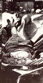
The Death and Disaster paintings could also be read as religious, and they are my favourite of Warhol's screen-paintings. They are my favourites partly because I love the colours of the '5 Deaths' car crash pieces, but also because they do such a great job of confusing the issue of the importance of the subject. Sure, the paintings are about the morbid fascination humanity has with death and disaster, but they are also about nullifying that fascination through multiplication. When he painted the multiple Mona Lisa's Warhol supposedly said 'thirty is better than one', but he was also saying that the multiple strips away the individuality, takes the uniqueness of any given thing and tosses it aside. So through the multiplication of the frozen moment the Death and Disaster paintings similarly toss aside all notions of humanity and leave only abstract form. Only a wraith like after meaning of the moment itself remains, like the ghosts of those nameless victims forever frozen in time, doomed to haunt the Art galleries of the globe forever and a day. All of which means of course that The Death and Disaster paintings are about that sense of detachment, of distancing oneself from the disquieting and violent contents of the world. It's perfectly captured in the 'White Burning Cars 1' painting of 1963, in which car crash victim Richard J Hubbard hangs impaled on a spike on a telegraph pole in a Seattle street. In the background another man strolls past on the sidewalk, hands in pockets, seemingly oblivious to what is happening only yards away from him. That enormous emotional distance in the source photograph is indicative of the emotional detachment Warhol was striving to achieve through his paintings. You could say that such distance is essentially a religious distance, and that Warhol's life and work can be seen as a religious journey. There's a sense of Warhol striving to stay somehow pure through his work, wanting to keep his distance from emotion and from human connectivity. It's as though he senses that it is through emotional connection that the road to pain and ruin lies, and whilst he wants more than anything to avoid this, he cannot help but be attracted by it. Warhol's work, his life, is as much about this conflict as anything else; he's using his very deliberate detachment as his means of staying devoutly religious, at least in his eyes, or in the eyes of his work which is much the same thing of course. So much of Warhol's work gives the impression of someone desperately interested in the weird and wonderful machinations of the human psyche, but also someone who has a deep seated religious fear of recriminations at the Pearly Gates, so that he does not allow himself to be drawn into the actions of the world, but instead lives vicariously through his voyeurism of others. It's unknown, of course, in what light Warhol's God ultimately saw such (in)actions... My second favourite of the Death and Disaster paintings is '5 Deaths on Turquoise' simply for that colour, but my absolute favourite is the large '1947 - White' painting. This painting repeats a photograph of a 23 year old model who jumped from the 86th floor observation deck at the Empire State building and landed on the roof a car. It's a remarkable image; the beautiful young woman cradled in the metal of the car's roof seems almost to be asleep and recalls Millais' Ophelia, drifting downstream in her strange restful repose. It's really quite beautiful, as much for the erasing of the meaning in the subject as for the obvious (if oddly warped) beauty of the subject matter itself. There's a school of thought that says Warhol's work was much less interesting after his shooting at the hands of Valerie Solanis, and whilst there's occasional truth in that stance, it's also, thankfully, flawed, because Warhol produced some fantastic work in the 1970s and '80s which explored his role as a painter much more than before. |
|
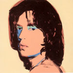
A lot of the work from this period was commissioned portrait work, and of course some commissions worked out better than others. The Mick Jagger portraits are especially lovely though, with that glorious turquoise green cropping up on the eyelids again, just as it did on Marilyn, and on some of Andy's self-portraits. The over-painting on these portraits is especially interesting, and as I've said before really seem to prefigure digital techniques of drawing, whilst Warhol of course famously said at one point that he did such over-painting on these portraits because the customers 'expected more for their money'. I like the large skull paintings of '76 but don't much like the smaller ones, because where the large ones become very much about the colour and the very presence of the picture as a whole entity, the small ones are still just skulls. It works similarly with the Electric Chair paintings too, although here the 'Twelve Electric Chairs' set works dynamically because the colour combinations are so, if you'll excuse the pun, electric. Bunched together they remind me of the sleeve of Cecil Taylor's Unit Structures Blue Note album which I'm sure is not accidental, since both date from more or less the same point in time, and of course Warhol himself did some Blue Note sleeves, back in '58 notably with the pink and blue covers of Kenny Burrell's Blue Lights volumes 1 and 2. The large scale Camouflage paintings, and the Piss Paintings too, recall Monet's Water Lilies. It's to do with the scale and format I think, but also with the way the forms connect and play off one another. It's all rather fine. Even better are the smaller, more colourful square camouflage paintings, which recall the Michael Stubbs works seen the previous day at the Entwhistle gallery in Cork Street, and which I want to see again to check out the pork chop forms my eye missed seeing at the time, being too engrossed solely in enjoying the lovely smooth layers of poured paint. Much less impressive for me are Warhol's large shadow paintings. If they were just straight ahead screens, or painted surfaces they would be fine, but the inclusion of the diamond dust just makes them ridiculous. It's as though Warhol is saying that they won't be valuable enough as just paintings of shadows, they need something more to hang on, conceptually. Which is untrue of course. They don't need anything else, because formally they work fine and ultimately the dust just cheapens them. Which of course was maybe the point all along. I don't know. I just know I don't like them. Similarly, I don't like the Rorschach paintings that end the show. Actually that's not true. I HATE the Rorschach blot paintings, they are just ridiculous, and thankfully the paintings don't make it into the catalogue. I can see the connection of course with his earlier drawing technique, and maybe it is a neat means of wrapping up the show contextually in one way, but really... These paintings are the pits. For once that last damning critique of 'a five year old could have done that' rings true, because this is just lazy painting, the kind of stupid tired tricks primary school kids do to waste paint. Or high school kids, if they are particularly bored and dumb. 'Bored and dumb'. That sounds like something Warhol would have led the media to say about his work of course, so maybe it is fitting after all. But I have to say I don't think so. Because I think that this retrospective shows that despite the surface appearances that he projected, despite the image and (lack of) meaning he mediated for himself and his work in his lifetime, Warhol's art was, and remains anything but. Warhol's art was, is and will continue to be exhilarating, intellectually stimulating stuff. And, give or take the odd slip, it's awesomely lovely to look at. © Alistair Fitchett 2002 The Andy Warhol show is on at the Tate Modern, Bankside, London, UK until April 1st 2002. Details from the Tate site here: http://www.tate.org.uk/warhol/ The catalogue is published by Tate Publishing. For the Death and Disasters series go for Andy Warhol's Death and Disasters by Houston Fine Art Press. Andy Warhol Drawings 1942 - 1987 is published by the Andy Warhol Museum / Art Data and is gorgeous... If you really have money to burn, Phaidon will soon be publishing Volume One of Andy Warhol Catalogue Raisonné. Covering paintings and sculpture from 1961 to 1963, the book/series promises to be nothing short of exhaustive, and for Ł150 damn well ought to be. For your interest, my birthday is in April and gifts can be sent to me at the contact mailing address... |