Travelling Without Motion | |
| The early 1990's were great years for electronic Pop music. Those were years in which it seemed as though new avenues were being explored; avenues illuminated in a somewhat shady light by the lingering luminance of the flares sent up during the Acid revolution, and with the explorers for the most part it seemed living off a kind of post-punk adventurous spirit. Everyone has their favourites from any era of music of course, and my one of my own from that time would probably be Ultramarine, whose Every Man and Woman is a Star was rightly judged to be a seminal, epoch-making achievement, although 1993's United Kingdom was really almost as fine, but maybe being more rural and earthy kept it from gaining the same kind of reputation as its predecessor. Other favourites of the time were the monumental Sabres Of Paradise, who made maybe the finest Pop record ever in 'Smokebelch' and delivered two fantastic albums in Sabresonic and Haunted Dancehall before collapsing and metamorphosing into something new and equally wonderful in Two Lone Swordsmen. The Sabres also had a terrific label, and released a clutch of awesome House cuts, several of which were collected on the outrageously fine Septic Cuts. Other peerless label around the same time were Deconstruction and Boy's Own and then Junior Boys Own. They were each responsible for more timeless classics, with Deconstruction in particular reaching out to the masses and managing to breach the Real charts, although their finest moments for me were more unsung moments: 'Sly One' by Marina Van Rooy and 'Rollercoaster' by Ariel in particular deserve mention as being two of the finest Pop records ever made. And of course Van Rooy had connections with the Pale Fountains and Shack, and two members of the Ariel gang would go on to hit pay dirt as the much less interesting Chemical Brothers. Boy's Own meanwhile gave us at least one other classic in Bocca Juniors' awesome Ibiza anthem (when that still kind of meant something) 'Raise', and let's not forget that Denim's Back In Denim appeared on Boy's Own, which is as clear a sign of good taste as you'll find. Junior Boy's Own, meanwhile, gave us Underworld. 'Rez' was the first Underworld track I ever heard, and for me they never bettered it. 'Rez' is one of those tracks that whenever I hear it I'm transported... to God only knows where, but whatever... It's such an amazing track, especially the beginning that builds and oscillates wildly, frequencies and sequences creeping and winding around your psyche, taking you away, away, away. It's up there as one of the greatest intro's to songs by anyone, anywhere, linking arms with the Kink's 'Waterloo Sunset', The Claim's 'Not So Simple Sharon Says', the Sea Urchins' 'Pristine Christine', Herbie Hancock's 'Rain Dance', Bukem's 'Music'... Then there was Underworld's 1994 album dubnobasswithmyheadman. It was a great record, stuffed full of dynamic new electronic Pop making deft nods to dub, House and Techno and it deservedly entered into mythology almost immediately. I still remember buying it, in the depths of January, pulling the sleeve from the racks at Binary Star, which was Exeter's premier record store back in the day and marvelling at the gorgeous design, all stark black and white typography playfulness that reminded me of the great McCarthy sleeve for 'Nelson Rockefeller' on which designer Andy Royston used one of Marinetti's great Futurist typographic-poetry experiments. And really it was the sleeve of dubnobasswithmyheadman that appealed to me as much as the music. Which wasn't really a surprise because at the time there seemed to be a really exciting explosion of creativity around the whole music / design axis, with people taking the emerging accessibility to digital media and really pushing envelopes, taking risks, defining for themselves new rules and breaking them as soon as they were set; reaching out for new definitions and exploring all kinds of possibilities. It was no surprise then to learn that Rick Smith, Karl Hyde and John Warwicker were not only the members of Underworld, but were also members of the Tomato design group responsible for the artwork. Tomato have been responsible for some great design in the decade of their existence, and they've put together a clutch of great books in which they've sought to showcase their skills and expose something of the process of their creativity. |
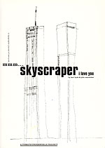
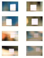
| First of all there's mmm skyscraper I love you (Booth-Clibborn Editions), which was initially devised as the companion book to dubnobasswithmyheadman. This seems like such a wonderful idea; book and album tie in. So much more, ah, enlightened than the collection of promo videos most bands and labels throw at their fans. What would be better than a book/album connection? Maybe an album/gallery installation. Maybe not. Mmm skyscraper I love you is a terrific book. First of all, it smells like books should. I don't know enough about papers and inks to know the specifics of this, but it's a smell that always makes me want to pick up and enjoy books and magazines. It's the smell of Kim Hiorthoy's Tree Weekend, and it's the smell of Careless Talk Costs Lives amongst others. Glorious. It's not quite the smell of hot photocopies, but it's close. I love the smell of photocopiers, and the artwork in mmm skyscraper is clearly based a lot on playing with photocopiers. I did a lot of work when I was in Art school and then again when I was doing my post-grad, blowing up bits of images on copiers, slicing them up and collaging them into new forms, then painting on top of those composites and then copying that again, and so on and on, and maybe that's why I'm so drawn to this work. It reminds me of something of my past, a time when I was able to explore and experiment... a time when I had time. I know I'm also drawn to mmm skyscraper because it is 'about' circumnavigating the urban space, specifically in this case, Manhattan. There's a real sense in the book of travelling through the city, the pages acting like some kind of printed field recording, cascading the cacophony of visual text and aural experience, boiling it down to a bare black and white dynamic, like a '50s Noir movie with madcap subtitles fed through a photocopier a hundred times and then attacked with a scalpel. I know I'm also drawn to mmm skyscraper because it reminds me of some of my own favourite Art / Design moments from the past, specifically the aforementioned Marinetti piece, but also the great Merz Dada magazine, Fortunato Depero's great 'New York' text piece from 1929 and Donald Wall's great Visionary City - The Arcology of Paulo Soleri book from 1971 which seemed to tread similar ground, and which I remember marvelling at in the Art school library years ago. And of course in a more abstract sense the pages also recall those magnificent Franz Kline paintings, and perhaps more especially Robert Motherwell's 'Elegy to the Spanish Republic', which I recall being close to tears in front of when I saw it for the first time in the flesh in Bilbao in 1999. In mmm skyscraper, the Tomato team use a terrific convergence of techniques and technologies, and whilst it's clear that both photocopiers and computers might be at the head of the list, they don't rule the project. The computer is not allowed to stamp any kind of technological signature on the work, and this is the real appeal of the Tomato work. So much of the artwork produced on computers ends up carrying the stench of the technology, which overpowers any individuality or creativity. Although having said that, you could say the same of any medium; that a lack of interesting ideas will always lead to a work where the medium overpowers the essence of the work, and that maybe computers just make such a situation more transparent. This is, I guess, about having good processes to work through. Good process leads to good work, whilst crap process leads to... you get the idea. |
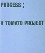
| It's no surprise then that another of Tomato's books is called Process (Thames and Hudson), which contains some great interviews and quotes from a variety of artists, from Alfred Leslie, to Suzuki Seijun and Graham Greene alongside, of course, examples of intriguing photographs, typography, drawing... mixtures of all of the above, and more. In a sense Process is about the commodification of process itself; is about selling the idea of process to the (specifically design) world. But what the book, and the Tomato group do so well is illuminate the fact that process is a vast, fluid concept, and not some easily definable checklist of stages to rigidly move through. Process recognises and celebrates the magic of chance and accident, and of the way that, if only we can recognise the potentials that they present, those chances and accidents can be manipulated to create something of real interest and excitement: Process sees the world as the palette, rules nothing out and nothing in. Process, at its best, as in Process at its best, sets up dynamically changeable structures from which to hang whatever comes to hand; maps out a geography of the soul and of the mind, providing springboards from which to make leaps of expression. The third Tomato book I have seen is Bareback. Published in 1997 by Lawrence King, this is more of a mixed collection than either Process or mmm skyscraper, being without an easily recognisable theme to hang the work on. I have to say that I think it does suffer slightly from this; but only slightly, because really it's another delicious collection where image and text meet. If there's a weakness in the dance of text and image though, it's in the specifics of the words, or at least it's in the points when it seems like those words are meant to be read in a particular sequence. Because whereas in mmm skyscraper the text is abstracted, is manipulated to become an aural and a visual element all at once, too often here the words seem to take on importance more on their traditional level and, heaven forbid, it's almost like reading poetry, which I just happen to have problems with, so maybe it's just me. But if it is poetry, it seems to me to be particularly flaccid poetry, which is a shame. Maybe Tomato should have roped in a 'real' poet to collaborate. And maybe I wouldn't know a 'real' 'poet' if one landed on my lap. Which, incidentally, I pray to goodness never happens... |
| More interesting in terms of contents are the words that appear to be handwritten extracts from notebooks, diaries, letters, which seem to be printed on acetates and overlaid over textural grounds or photographs. Also good to read are the notes on a trip to the Arizona desert and Las Vegas, which spread over several pages atop what look like photographs of reflected interior windows looking out at a sunrise, or set. Visually intriguing are the pages of tiny text printed as spot varnish on top of vivid colour. Almost impossible to read, these pages force the viewer/reader to make an effort in their consumption of the work, and if, as in the 'poetry' earlier in the book the actual content of the text is again less interesting, you are at least left with the essence of a lovely visual idea, an 'artistic' interpretation of a commercial process. And really, that's where Tomato really excel, is what on one level they are all about: they take the commercial world of advertising, printing and packaging and turn it, if not on its head, at least at a jaunty, intriguing angle. On another level though, on the conceptual 'Art' level perhaps, Tomato are about the recording of lives (their own and ours) ebbing and flowing, moving through time and experience, making connections between moments and allowing fragments of thought space to blossom, or wither, it almost makes no difference because there's beauty and interest in both. Of course time moves fast in Media, and just as the sounds of the electronic renaissance of the mid to late '90s seems already like a glorious flowering of possibility whose insistence on cross-pollination and adventurous sprit seems largely to have evaporated from the current contemporary musical landscape, so the visual style of Tomato already seems to be from a similarly different age: an age that seems oddly at odds with the one currently unfolding, at least in front of my own eyes. So that whilst Tomato, through their commercial work with the likes of Levi's, Pepsi, Nike, Sony, MTV, Philips, Orange telecommunications and Coca Cola, might have helped generate new additions to the vocabulary of contemporary design, it also seems a little as though that expansion has simply stopped dead in its tracks. So that instead of the on-going delighted embracing of multiple possibilities presented by an immersion in a mixed bag of materials, there is currently instead more of a reliance on a recognisable style that takes few real risks, makes few leaps of faith. Mistaking routine and rigid formula over true process driven work, some designers and artists would do well to glimpse back, even just the relatively few years to these Tomato tomes, to remind themselves of the possibilities that are surely still there for the developing. © 2002 |