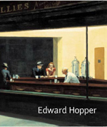
Firstly theres the catalogue for the Edward Hopper exhibition at the Tate Modern. Now I dont know what you make of Hopper, but for me hes always been someone of interest, ever since I saw one of his paintings on the cover of an old Penguin publication of a Carson McCullers novel. Introductions are important, they help set your personal context, and that is so crucial in creating lasting relationships.
Of course so many of Hoppers images have become iconic, but they deserve it because they are fantastic paintings and terrific pictures. Naturally most people see the picture and that is fair enough. Not everyone cares too much about painting after all and why should they? It was interesting walking in the gallery looking at the paintings in the flesh and listening in on conversations. Almost all of the discussions I eavesdropped concerned the content of the pictures: musings on the relationships between the characters, imagined narratives behind the lonely individuals. Who, why, wherefore and what if It was slightly strange, because I guess Ive been there, done that, dont really care about it any longer. By which I suggest nothing other than the fact that, well, Ive been there, done that, dont really care about it any longer. No judgements.
Of course Hopper has a way in to my heart just through the content and the context of the moment in history and geography of many of the paintings. The mediation of America of the 30s through the 60s has such a delicious pull. Particularly urban America. So step up the aforementioned McCullers, the magnificent Chandler, Hammett, Kerouac, John Fante, Hitchcock, John Huston, Bogart and a host of others: All of them in one way or another adding to a mythic imaginary past and place.
Its Hoppers urban paintings that appeal to me most. As pictures they are great stories of the Blues: what is left unsaid or unseen being as vital as what is portrayed. What is left out is often more important than what is put in: a lesson many could learn in so many disciplines. But whilst I adore the whole aesthetic, what I enjoyed so much this time about seeing his work was the actual feeling of falling in love with the paintings as opposed to the pictures.
Structurally, compositionally they are exquisite. His use of shape and colour is gorgeous, his manipulation of space seductive and tender. The rhythms of the city surface in the paintings time and time again, in the Mondrian grids of windows and doorways, in the spacing of the bar stools in Nighthawks. The more you look, the more it becomes apparent that this isnt painting as a means of recording time or place, but rather painting that uses recognisable contexts as a means of exploring the essence of painting itself. Its almost as though all the other things that make Hoppers work so appealing (the mystery, the potential narratives, the emotional electricity) are coincidental side effects, and thats fair enough after all.
Oh, and Im aware of course that my approach to these paintings is the opposite to the one I normally take in relation to other art forms, and specifically music. Is there a fundamental difference between the forms that demands this, or is it just a kind of snobbery at work? Is it because I simply do not understand the structural and technical aspects of music that I shun approaching it in that way? And does it really matter at all?
As for the catalogue, well, its good but of course as is the nature of these things, the colour reproduction misses much of the subtle vividness of the reality. The exhibition is on until September 5th, so if you are in London do yourself a favour and go see it.
Of course the motif of urban details is one that I am personally interested in, and so I was excited to pick up Burhan Dogancys Walls Of The World. The celebrated Turkish painter / photographer has been documenting city walls with his camera for several decades now, and this collection catalogues a wide selection that organises the images into categories such as faces, political issues and hearts and other universal symbols. Its a good way of making a sense of the collection, and creates a sense of a peculiarly cohesive and convergent world culture as elements weave themselves across continents and time. When I first looked through the book I got a strange feeling that I was looking at my own photographs, and I started to wonder if my own work in this realm was therefore irrelevant and pointless. But then I figure that everything has been done, so why worry about concepts of originality, and just because others are interested in the same things I am, are recording the same kinds of pictures I am, it doesnt mean I should just give it up. Right?
The collection also raises the eternal question that will always be raised by such pictures: where does the art lie? When the image is that of anothers handiwork and/or the effects of architecture and natural urban decay, whose is the art? As a photographer is my eye for the picture and the interest in the idea enough?
Madame Yevonde had a different opinion on the idea of originality. Be original or die! she said. But it was the 1930s and postmodernism was yet to rear its head, so in such a context its more than understandable. It reminds me of that great Fire Engines slogan: boredom or Fire Engines, you cant have both! and thats a good thing of course.
I said before that introductions are important, and I was introduced to Madame Yevonde through the fantastic early 90s single by Animals That Swim. If were going to have colour photographs, lets have a riot of colour sang the Animals, and thats a great way in to Madam Yevonde, the great pre-WW2 champion of colour photography through her use of the aptly named Vivex colour process. Its Yevondes work from the 30s that remains the most resonant, and her magical portraits of English socialites of the era dressed as goddesses are rightly regarded as classics. Track down the National Portrait Gallerys 1990 catalogue and youll be treated to the entire goddesses collection and lots more besides. Personal favourites of mine would be the gloriously rococo still life compositions and the double page spread of Portrait Study the Ear-ring of 1932 and the 1936 portrait of Vivien Leigh, both of which positively explode from the page with their brilliant red backgrounds.
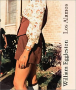
I love all of Egglestons photographs but I particularly like his shots of isolated figures, like the wall mounted booth juke-box control from Los Alamos in 1967, the white ceiling fan from Washington D.C. in 1990 (like a ghostly partner to the Mississippi red ceiling) or the dusty old telephone from Kenya in 1980. They have a peculiar grace and a compelling hint of the sinister, and I love them madly.
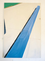
The 2 and a quarter collection from Twin Palms is also worth investing in. It has some gorgeous shots of automobiles and trucks, from a rusting shell turned over on its roof to a beautiful pale custard yellow sports coupe parked in the evening light in front of a similarly coloured metal siding, with electricity pylons above. The red pops up in this collection too, in the centred rectangle of a ladys handbag in a rare full-on portrait; in the almost centred stencilled auction on a white block wall; in the hattleys sign hung out over the street; in the vivid body of a truck seen from low down.
I mentioned the Los Alamos juke box a moment ago, and its there again of course in Scalos publication of the Los Alamos series. This is a hefty book, but its magnificent and I cant stop looking at it. Eggleston rarely photographs people, but they do crop up in Los Alamos and they are invariably great shots. The cover image is sublime, and very early 70s, as is the classic shot of the grocery store boy pushing shopping carts. Elsewhere its all classic Eggleston and what more could you ask for?
Theres a good essay at the back of the book by Thomas Weski in which he considers that he finds a photograph interesting when a difference between our respective perceptions occurs. With regard to Eggleston this is the opposite of how I feel: I feel like Egglestons photographs are saying exactly how I view the world it feels like I have a strong affinity with these images, share some kind of kindred spirit, and that means a lot. He doesnt particularly open my eyes to new things, but rather makes me feel less alone, makes me think that there is so much scope in this kind of consideration of the things we see, and the way in which we form those things into images.
Theres something of Eggleston in Stephen Shores work too. Something of Edward Hopper, also (check out the shot of J.J. Summers Agency in Duluth from 1973 and tell me it isnt so), and thats no bad thing. Looking through his Uncommon Places book, Im struck by what feels like a last gasp of a dusty decayed 50s / 60s innocence lost, soon to be replaced by the glossy boom of the 80s. Looking at these images too Im struck by something Carrie used to say about visiting Scotland from Canada in the late 70s and early 80s, about how it felt like coming to a third world country. It strikes me that going out into America might have felt the same Shores photographs certainly give it that grimy, slightly soiled edge: a glimpse of the crumbling reality behind the façade of prosperity.
Of course there is irony in the collections title, because these are photographs of what appear to be very ordinary places indeed. It raises the question of how we label things, and it comes back to the idea that we can find something of interest in so much if we can use our eyes and our minds. Theres also something intriguing in the whole idea of the quality of place, and the value we put on place as individuals. Its something that intrigues me, and Shores photographs draw me in and make me wonder.
More peculiarly British images come courtesy of the slim English Candies collection by A J Wilkinson that I picked up recently. The premise of the exhibition from which these images are selected was to shoot portraits of people whose lives were changed in some dramatic way by Punk. So we have a range of portraits of individuals, all late thirty somethings at least, I would wager, in a variety of poses and situations, most of whom seem only oddly familiar in a vague way, but then Ive always been bad with recognising people anyway, so what the hell. I do recognise John Robb, however, and both he and Jon Savage (who might also be pictured, but to be honest I wouldnt really have a clue what Jon Savage looked like) contribute essays, of which Savages seems to make the most connection with the photos.
Finally, then, its back to the US, and to New York, for the work of Laurie Simmons and her In And Around The House collection. This is a fantastic book, and its given me some great ideas for things to do with my photography students in school. Basically this is a collection of set pieces that Simmons created between 1976 and 1978 using old wallpaper, fabrics and dolls house furniture. The black and white photographs are gorgeous explorations of light and composition, and are intriguing near-surrealist tableaux of domesticity. And when Simmons introduces a single doll figure into the scenario, it all takes on a strange social-political edge, becomes an odd commentary on the nature of the domesticated female figure in American culture. Its a bit like Cindy Shermans film stills, only with a doll.
These photos are carefully constructed and manipulated compositions and are far from the kind of images that usually thrill me, yet thrill me they most certainly do. Perhaps I will spend less time out in the streets with my camera this summer and more time in the attic constructing situations to explore with the lens...
Im off to look for dolls house furniture on eBay.
© 2004 Alistair Fitchett