
We could argue until the cows come home about what punk may have changed, but certainly the way records looked changed because of punk. And Neville Brody followed on from punk-emboldened designers like Jamie Reid, Malcolm Garrett, Linder, Peter Saville, and Rocking Russian. He designed memorable sleeves for important records like Defunkts 'Razors Edge' and The Return of the Giant Slits, but he is most closely aligned with the great underground label Fetish, run by Rod Pierce. Fetish, which was active in the early 80s, is the closest the UK came to the exoticism and adventuresomeness of Ze. It had its roots in Throbbing Gristle/William Burroughs experimentalism, and released records by TG disciples 23 Skidoo, Clock DVA, as well as New York No Wave associated acts like the Bush Tetras and Lydia Lunchs 8 Eyed Spy, and the straighter pop of the Bongos.
Fetish and its acts granted Brody the creative space and freedom to produce some bold and beautiful sleeves for what were bold and beautiful records. Brody says: My work for Fetish came out of a gut reaction to its music, and the situation it was being published in. I wanted to force the record buyer into a state of consideration a gut reaction to my gut reaction. We never wanted to present things on a plate but the dominant themes of my design were to open gateways that had been shut through fear, and to point to the loss of human identity and dignity within our immediate environment. Its hard to imagine any label now allowing a designer such a free hand.
The group Brody was closest to was 23 Skidoo, who along with A Certain Ratio and Cabaret Voltaire (another group Brody worked closely with) fused Throbbing Gristle influenced warped pop with pan-rhythmic rumbles and rambles across the worlds dancefloors. Each group would share degrees of obsession with Burroughs, Gysin, funk, dub, Kenneth Anger and martial arts movies, as the Cabs Stephen Mallinder put it. Soul assassins 23 Skidoo would record a series of pioneering and perverse classics, veering from rousing fractured funk to apocalyptic tribal cathartic capers. Along the way they would lose and gain members, most intriguingly adding Sketch from pop-funk outfit Linx on bass, who would remain with Fritz Caitlin, Alex and Johnny Turnbull, as the stable 23 Skidoo core for many years, laying the foundations of UK hip hop with their Ronin label.

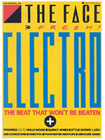
Brodys lasting success was undoubtedly in designing The Face, which he did for much of the 80s. The way he made the magazine look turned things upside down. Now The Face is long gone. In its place is a panoply of pop/style/leisure/culture/arts supplements. But once there was pretty much nothing. And at the start The Face was a great pop magazine, that challenged lots of preconceptions of how a magazine should look, and which happened to contain some great journalism. Im thinking of Julie Burchill and Robert Elms at their most entertaining. Im remembering Jon Savage on Punk Five Years On, The Age of Plunder, and The Teds. Im pondering on Paul Morley moonlighting, writing about Cabaret Voltaire, circa Red Mecca, like they were teen pop idols. Im picturing some of the great photos The Face ran, of pop figures like Kim Wilde, Annabella Lwin, Cristina. That was my Face, for a while at least.
The Face as a magazine constantly evolved during the 80s, becoming in many peoples eyes synonymous with consumer-capitalism, which to some equated to Thatcherism and entrepeneurship, the rise of style over substance, the new media and marketing meritocracy. Brody seems to have become increasingly unnerved at the way his innovation was lifted and twisted. He is quoted as saying: There were times when I felt my work had been ripped off so much that I didnt want to make any new statement on the page whatsoever. Its an awkward fascination with and horror at the prevailing frenzied consumer consciousness that is shared by the great pop writer Michael Bracewell in early books like Missing Margate and The Crypto-Amnesia Club.
Hebdige himself started out in 1974 with an argumentative and groundbreaking paper for the University of Birmingham on The Style of The Mods, where he concludes: Like the surrealists the mods underestimated the ability of the dominant culture to absorb the subversive image and substance of the anarchic imagination. From celebrating mod being pure unadulterated STYLE, the essence of style in 1974 Hebdige just over a decade further on would find himself needing to disassociate from the overall fetishisation of style. He acknowledges the importance though of reserving the right to change our minds and alter our positions.
One position that hasnt changed, whatever our take on the 1980s, is the importance and impact and sheer beauty of Neville Brodys work. Its all still there in the glorious book The Graphic Language of Neville Brody.
© 2006 John Carney